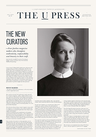


Issue 9
[Issue Editor, Interviewer]
The New Curators
Four fearless magazine makers who champion authenticity, responsibility and bravery in their craft.
–
Come 14 and 15 March 2015, Underscore will present the inaugural launch of The U Symposium. The first of its kind in Asia, The U Symposium will celebrate and also feather discussion on the theme of Magazines Contemporary. The selection of speakers comprise a group of progressive magazine founders, editors and creatives of leading independent publications across the categories of lifestyle, design, art, fashion, food and travel. These visionaries have redefined the magazine culture of today with their originality, discerning taste and daring to experiment. in light of The U Symposium, we ask four of these inspiring personalities to provide insight into their journeys.
***
[Following interviews by Annabelle Fernandez and Luo Jingmei]
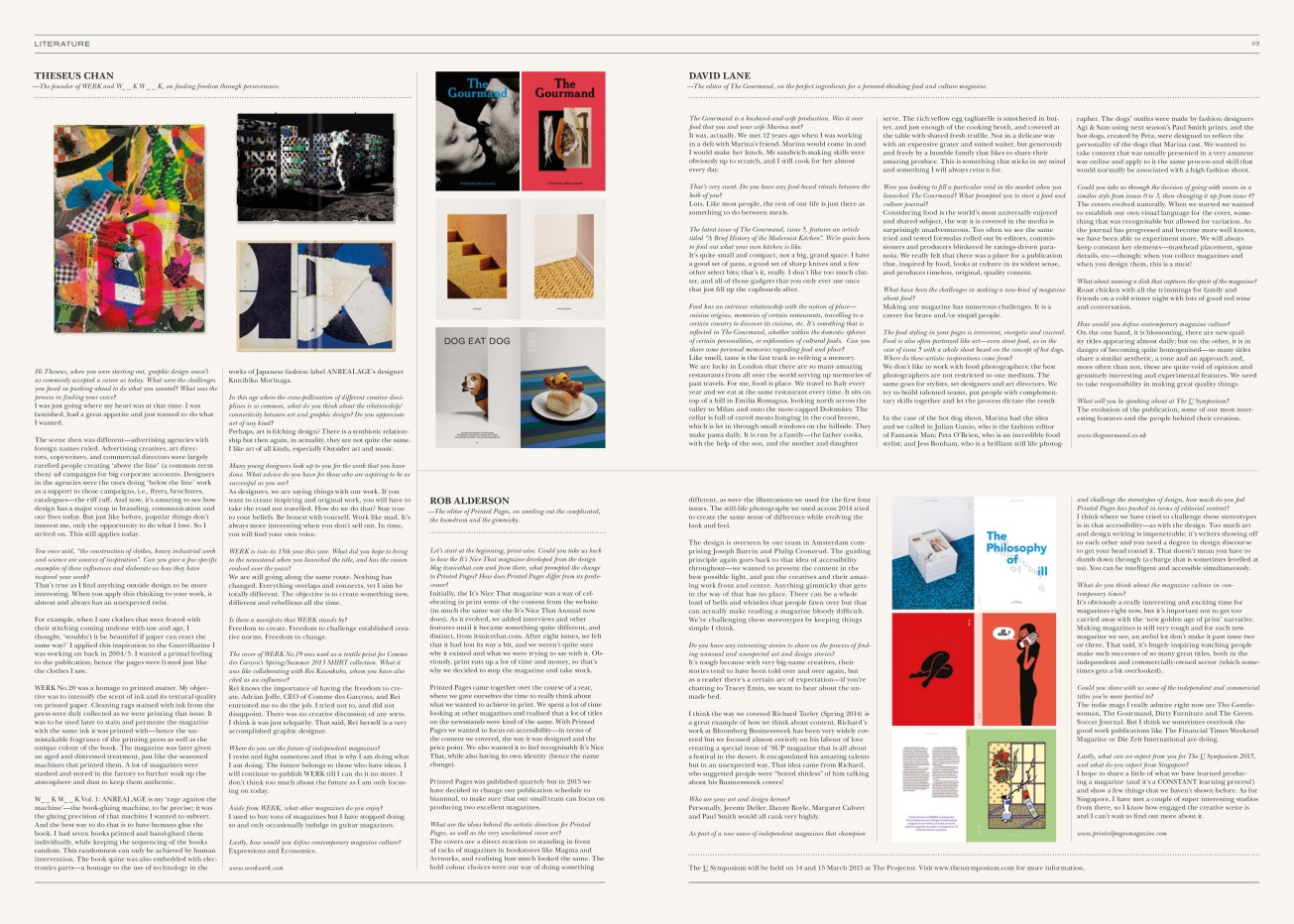
Theseus Chan,
—Founder of WERK and W_ _K W_ _K, on finding freedom through perseverance.
–
Hi Theseus, when you were starting out, graphic design wasn’t as commonly accepted a career as today. What were the challenges you faced in going ahead to do what you wanted? What was the process in finding your voice?
I was just going where my heart was at that time. I was famished, had a great appetite and just wanted to do what I wanted.
The scene then was different – advertising agencies with foreign names ruled. Advertising creatives, art directors, copywriters, commercial directors were largely rarefied people creating “above the line” (a common term then) ad campaigns for big corporate accounts. Designers in the agencies were the ones doing “below the lines” as a support to those campaigns, ie. flyers, brochures, catalogues – the riff raff. It’s amazing how design has a major coup in branding, communication and our lives today.
But just like before, popular things don’t interest me, only the opportunity to do what I love. So I strived on. This still applies today.
You once said, “the construction of clothes, heavy industrial work and science are sources of inspiration”. Can you give a few specific examples of these influences and elaborate on howthey have inspired your work?
That’s true as I find anything outside design design to be more interesting. When you apply this thinking to your work, it almost and always has an unexpected twist.
For example, when I saw clothes that are frayed with their stitching coming undone with use and age, I thought, wouldn’t it be beautiful if paper can react the same way? I applied this inspiration to the Guerrillazine I was working on back in 2004/5. I wanted a primal feeling to the publication, hence the pages were frayed just like the clothes I saw.
WERK No.20 was an homage to printed matter. My objective was to intensify the scent of ink and its textural quality on printed paper. Cleaning rags stained with inks from the press were duly collected as we were printing that issue. It was to be used later to stain and permeate the magazine with the same ink it was printed with—hence the unmistakable fragrance of the printing press as well as the unique colour of the book. The magazine was later given an aged and distressed treatment, just like the seasoned machines that printed them. A lot of magazines were stashed and stored in the factory to further soak up the atmosphere and dust to keep it authentic.
W_ _ K W_ _ K Vol. 1: ANREALAGE is my “rage against the machine”—the book gluing machine, to be precise; it was the gluing precision of that machine I wanted to subvert. And the best way to do that is to have humans glue the book. I had seven books printed and hand glued them individually, while keeping the sequencing of the books random. This randomness can only be achieved by human intervention. The book spine was also embedded with electronics parts—a homage to the use of technology in ANREALAGE designer Kunihiko Morinaga’s works.
Theseus, what does it feel like to be the Godfather of Graphic Design in Singapore?
I don’t know how this came about, but I take it as a form of regard for my efforts, the work and business done—only not as dramatically tragic as in Mario Puzo’s story. I feel regarded and accepted as part of a Singapore design community in which I am thankful. Grazie.
In your President’s Design Award statement, you mentioned as an advice to emerging designers: “Stop saying things that are politically correct (it’s boring), just say truthful to your beliefs.” Has going against the norm and being original landed you in any trouble?
It must have been a reaction to something that irked me during that time. Perhaps I was feeling that there wasn’t much originality in the industry and everyone was succumbing to cheap talk, making money and seeking fame for the sake of it. We became slaves to the Piper that blows the tune. A need to get there in a hurry.
Now, putting things in context, as designers, we are saying things with our work. If you want to create inspiring and original work, you will have to take the road not travelled. How do we do that?
Stay true to your beliefs. Be honest with yourself. Work like mad. It’s always more interesting when you don’t sell out and try to be with it. In time, you will find your own voice.
WERK is into its 15th year this year. What did you hope to bring to the newsstand when you launched the title, and has the vision evolved over the years?
We are still going along the same route. Nothing has changed. Everything overlaps and connects, yet I aim be totally different. The objective is to create something new, different and rebellious all the time.
What have been some of your favourite features since starting WERK?
Freedom to create. Freedom to challenge established creative norms. Freedom to change.
What are the elements that go into deciding on and creating each issue of WERK’s iconic covers?
Usually, nothing is decided. Things evolve as we go along. So, anything can happen.
Speaking of iconic covers, the cover of WERK No. 19 was used as a textile print for Comme des Garçons’ spring summer 2013 SHIRT collection. Do you have any of the pieces in your personal collection?
Yes, I was sent some as keepsakes.
The cover of WERK No.19 was used as a textile print for Comme des Garcon’s Spring/Summer 2013 SHIRT collection. What it was like collaborating with Rei Kawakubo, whom you have also cited as an influence?
Rei knows the importance of having the freedom to create. Adrian [Joffe, CEO of Comme des Garçons] and Rei entrusted me to do the job. I tried not to, and did not disappoint. There was no creative discussion of any sorts. I think it was just telepathy. It must be said that Rei herself is a very accomplished graphic designer.
Where do you see the future of independent magazines? Do you feel there is a sameness that is starting to saturate the market?
I resist and fight sameness and that is why I am doing what I am doing. The future belongs to those who have ideas.
Where does WERK stand in the midst of this; as one of, if not the, longest-standing independent magazines in Singapore?
I will continue to publish it till I can do it no more. I don’t think too much about the future as I am only focusing on today.
Aside from WERK, what other magazines do you enjoy?
I used to buy tons of magazines but I have stopped doing so and only occasionally indulge in guitar magazines.
How would you define contemporary magazine culture?
Expressions and Economics.
***
David Lane
—The Editor of The Gourmand, on the perfect ingredients for a forward-thinking food and culture magazine
–
The Gourmand is a husband-and-wife production. How did you and your wife, Marina Tweed, meet? Was it over food?
It was, actually; we met 12 years ago when I was working in a deli with Marina’s friend. Marina would come in and I would make her lunch. My sandwich-making skills were obviously up to scratch, and I still cook for her almost every day.
Do you have any food-based rituals between the both of you?
Lots; like most people, the rest of our life is just there as something to do between meals.
The latest issue of The Gourmand, Issue 5, features “A Brief History of the Modernist Kitchen”. Can you describe what your kitchen is like?
It’s quite small and compact, not a big grand space. I have a good set of pans, a good set of sharp knives and a few other select bits; that’s it, really. I don’t like too much clutter, and all of those gadgets that you only ever use once, and then they just fill up the cupboards.
Many of your original contributors, from artists to writers, are your friends. How did you meet these people?
They are friends from school, from art college, and just from living and working in London for 10 plus years. It’s a big city but like most places, it’s surprisingly small when you find something you like doing.
Food has an intrinsic relationship with the notion of place – cuisine origins, memories of certain restaurants, travelling to a certain country to discover its cuisine, etc. It’s something that is reflected in The Gourmand, whether within the domestic spheres of certain personalities, or exploration of cultural foods. Can you share some personal memories regarding food and place?
Like smell, taste is the fast track to reliving a memory. We are lucky in London that there are so many amazing restaurants from all over the world serving up memories of past travels. For me, food is place. We travel to Italy every year and we eat at the same restaurant every time. It sits on top of a hill in Emilia Romagna, looking north across the valley to Milan and onto the snow-capped Dolomites. The cellar is full of cured meats hanging in the cool breeze, which is let in through small windows on the hillside. They make pasta daily. It is run by a family – the father cooks, with the help of the son, and the mother and daughter serve. The rich yellow egg tagliatelle is smothered in butter, and just enough of the cooking broth, and covered at the table with shaved fresh truffle. Not in a delicate way with an expensive grater and suited waiter, but generously and freely by a humble family that likes to share their amazing produce. This is something that sticks in my mind and something I will always return for.
Were you looking to fill a particular void in the market when you launched The Gourmand? What prompted you to start a food and culture journal?
Considering food is the world’s most universally enjoyed and shared subject, the way it is covered in the media is surprisingly unadventurous. Too often we see the same tried and tested formulas rolled out by editors, commissioners and producers blinkered by ratings-driven paranoia. We really felt that there was a place for a publication that, inspired by food, looked at culture in its widest sense, produces timeless, original, quality content.
What have been the challenges in making a new kind of magazine about food?
Making any magazine has numerous challenges, it is a career for brave and/or stupid people.
What has surprised you about the ways people have responded to your magazine?
We are always surprised by the different audiences we reach. Whilst there is a target audience, we believe that if you take care to make great content, it can be enjoyed by all. Whether you are interested in art or music or film or literature, you will understand food as a medium to tell a story and in that way, it is very democratic.
The food styling in your pages is irreverent, energetic and visceral. Food is also often portrayed like art—even street food, as in the case of issue 5 with a whole shoot based on the concept of hot dogs. Where do these artistic inspirations come from?
We don’t like to work with food photographers; the best photographers are not restricted to one medium. The same goes for stylists, set designers and art directors. We try to build talented teams, put people with complementary skills together and let the process dictate the result.
In the case of the dog shoot, Marina had the idea and we called in Julian Ganio, who is the fashion editor of Fantastic Man; Peta O’Brien, who is an incredible food stylist; and Jess Bonham, who is a brilliant still life photographer. The dogs’ outfits were made by fashion designers Agi & Sam using next season’s Paul Smith prints; and the hot dogs, created by Peta, were designed to reflect the personality of the dogs that Marina cast. We wanted to take content that was usually presented in a very amateur way online but apply the same process and skill that would normally be associated with a high fashion shoot.
Could you take us through the decision of going with covers in a similar style from issues 00 to 3, then changing it up from issue 4?
The covers evolved naturally; when we started we wanted to establish our own visual language for the cover, something that was recognisable but allowed for variation. As the journal has progressed and become more well known, we have been able to experiment more. We will always keep constants (masthead placement, spine details, etc) though; when you collect magazines and when you design them, this is a must!
Has there been a similar evolution of content, editorially and in terms of art direction, as the issues go by?
The art direction has evolved but the constraints have remained the same. We use the same papers, the same format, the same typefaces (although we have recently designed our own versions with Monotype). We treat each feature as its own mini book and design the page accordingly, picking the right balance and arrangement of elements for the content in question.
If you had to choose a chef who encapsulates the spirit of The Gourmand, who would it be?
The Gourmand is not really about chefs; it is about expression. If you can only cook one traditional dish but for you it means a lot and inspires you and your diners, then that is just as valid and interesting as someone pushing the boundaries of contemporary cuisine.
What about a dish that captures the spirit of the magazine?
Roast chicken with all the trimmings for family and friends on a cold winter night with lots of good red wine and conversation.
How would you define contemporary magazine culture?
On the one hand, it is blossoming, there are new quality titles appearing almost daily; but on the other, it is in danger of becoming quite homogenised – so many titles share an aesthetic, a tone and an approach and, more often than not, these are quite void of opinion, and genuinely interesting and experimental features. We have proved that print is definitely not dead, but with that is a responsibility to make great quality things.
What will you be speaking about at The U Symposium?
The evolution of the publication, some of our most interesting features and the people behind their creation.
***
Rob Alderson
—Editor of Printed Pages, on weeding out the complicated, the humdrum and the gimmicky.
–
Let’s start at the beginning, print-wise. Could you take us back to how the It’s Nice That magazine began and, from there, what prompted the change to Printed Pages? How does Printed Pages differ from its predecessor?
Initially, the magazine was a way of celebrating in print some of the content from the website (in much the same way the It’s Nice That Annual now does). As it evolved, we added interviews and other features until it became something quite different, and distinct, from itsnicethat.com. After eight issues, we felt that it had lost its way a bit, and we weren’t quite sure why it existed and what we were trying to say with it. Obviously, print eats up a lot of time and money, so that’s why we decided to stop the magazine and take stock.
Printed Pages came together over the course of a year, where we gave ourselves the time to really think about what we wanted to achieve in print. We spent a lot of time looking at other magazines and realised that a lot of titles on the newsstands were kind of the same. With Printed Pages we wanted to focus on accessibility – in terms of the content we covered, the way it was designed and the price point. We also wanted it to feel recognisably It’s Nice That, while also having its own identity (hence the name change).
Printed Pages was published quarterly but in 2015 we have decided to change our publication schedule to biannual, to make sure that our small team can focus on producing two excellent magazines.
What are the ideas behind the choice of font and layout for Printed Pages, as well as the ideas behind the very uncluttered cover art? How do they relate to the content?
The covers are a direct reaction to standing in front of racks of magazines in bookstores like Magma and Artworks, and realising how much looked the same. The bold colour choices were our way of doing something different, as were the illustrations we used for the first four issues. The still-life photography we used across 2014 tried to create the same sense of difference while evolving the look and feel.
The design is overseen by our team in Amsterdam, Joseph Burrin and Philip Cornered. The guiding principle again goes back to that idea of accessibility though – we wanted to present the content in the best possible light, and put the creatives and their amazing work front and centre. Anything gimmicky that gets in the way of that has no place. There can be a whole load of bells and whistles that people fawn over but that can actually make reading a magazine bloody difficult. We’re challenging these stereotypes by keeping things simple I think.
Do you have any interesting stories to share on the process of finding unusual and unexpected art and design stories?
It’s tough because with very big-name creatives, their stories tend to have been told over and over again, but as a reader there’s a certain arc of expectation—if you’re chatting to Tracey Emin, we want to hear about the unmade bed.
I think the way we covered Richard Turley (Spring 2014) is a great example of how we think about content. Richard’ s work at Bloomberg Businessweek has been very widely-covered but we focused almost entirely on his labour of love creating a special issue of ‘SUP magazine all about a festival in the desert. It encapsulated his amazing talents but in an unexpected way. That idea came from Richard, who suggested people were “bored shitless” of him talking about his Businessweek covers!
Who are your art and design heroes?
Personally, Jeremy Deller, Danny Boyle, Margaret Calvert and Paul Smith would all rank very highly.
As part of a new wave of independent magazines champion and challenge the stereotypes of design, how much do you feel this aspect has been pushed in terms of editorial content?
I think where we have tried to challenge these stereotypes is in that accessibility—as with the design. Too much art and design writing is impenetrable; it’s writers showing off to each other and you need a degree in design discourse to get your head round it. That doesn’t mean you have to dumb down though (a charge that is sometimes levelled at us). You can be intelligent and accessible simultaneously.
What do you think about the magazine culture in contemporary times?
It’s obviously a really interesting and exciting time for magazines right now, but it’s important not to get too carried away with the “new golden age of print” narrative. Making magazines is still very tough and for each new magazine we see, an awful lot don’t make it past issue two or three. That said, it’s hugely inspiring watching people make such successes of so many great titles, both in the independent and commercially-owned sector (which sometimes gets a bit overlooked).
Could you share with us some of the independent and commericial titles you’re more partial to?
The indie mags I really admire right now are The Gentlewoman, The Gourmand, Dirty Furniture and The Green Soccer Journal. But I think we sometimes overlook what people like The Financial Times Weekend Magazine or Die Zeit International are doing.
Lastly, what can we expect from you for The U Symposium 2015, and what do you expect from Singapore?
I hope to share a little of what we have learned producing a magazine (and it’s a CONSTANT learning process!) and show a few things that we haven’t shown before. As for Singapore, I have met a couple of super interesting studios from there, so I know how engaged the creative scene is and I can’t wait to find out more about it.
