Issue DA86 Aug/Sept 2015
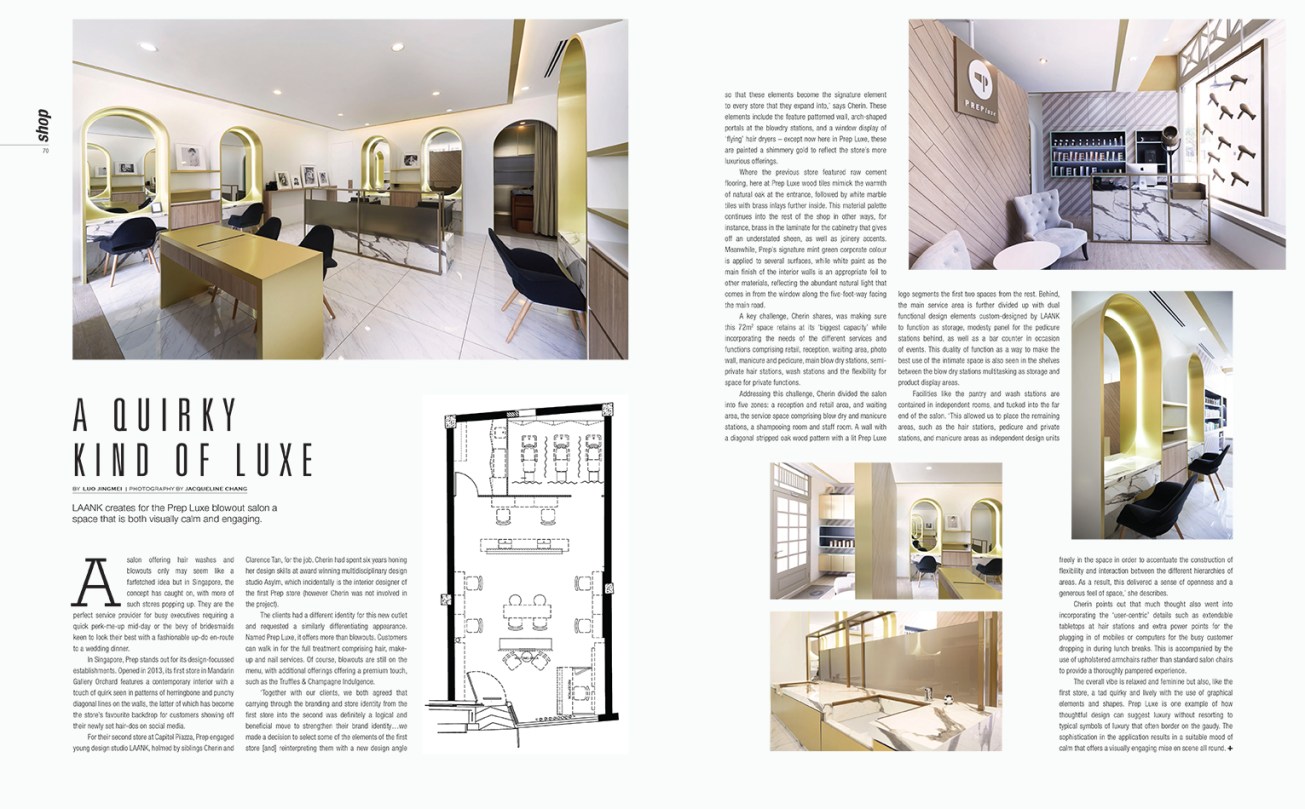
A Quirky Kind of Luxe
LAANK creates for the Prep Luxe blowout salon a space that is both visually calm and engaging.
_
A salon offering hair washes and blowouts only may seem like a farfetched idea but in Singapore, the concept has caught on, with more of such stores popping up. They are the perfect service provider for busy executives requiring a quick perk-me-up mid-day or the bevy of bridesmaids keen to look their best with a fashionable up-do en-route to a wedding dinner.
In Singapore, Prep stands out for its design-focussed establishments. Opened in 2013, its first store in Mandarin Gallery Orchard features a contemporary interior with a touch of quirk seen in patterns of herringbone and punchy diagonal lines on the walls, the latter of which has become the store’s favourite backdrop for customers showing off their newly set hair-dos on social media.
For their second store at Capitol Piazza, Prep engaged young design studio LAANK, helmed by siblings Cherin and Clarence Tan, for the job. Cherin had spent six years honing her design skills at award winning multidisciplinary design studio Asylm, which incidentally is the interior designer of the first Prep store (however Cherin was not involved in the project).
The clients had a different identity for this new outlet and requested a similarly differentiating appearance. Named Prep Luxe, it offers more than blowouts. Customers can walk in for the full treatment comprising hair, make-up and nail services. Of course, blowouts are still on the menu, with additional offerings offering a premium touch, such as the Truffles & Champagne Indulgence.
“Together with our clients, we both agreed that carrying through the branding and store identity from the first store into the second was definitely a logical and beneficial move to strengthen their brand identity…we made a decision to select some of the elements of the first store [and] reinterpreting them with a new design angle so that these elements become the signature element to every store that they expand into,” says Cherin. These element include the feature patterned wall, arch-shaped portals at the blowdry stations, and a window display of ‘flying’ hair dryers – except now here in Prep Luxe, these are painted a shimmery gold to reflect the store’s more luxurious offerings.
Where the previous store featured raw cement flooring, here at Prep Luxe wood tiles mimicking the warmth of natural oak at the entrance, followed by white marble tiles with brass inlays further in. This material palette continues into the rest of the shop in other ways, for instance, brass in the laminate for the cabinetry that gives off an understated sheen, as well as joinery accents. Meanwhile, Prep’s signature mint green corporate colour is applied to several surfaces, while white paint as the main finish of the interior walls is an appropriate foil to other materials, reflecting the abundant natural light that comes in from the window along the five-foot-way facing the main road.
A key challenge, Cherin shares, was making sure this 72-square-metre space retains at its “biggest capacity” while incorporating the needs of the different services and functions comprising retail, reception, waiting area, photo wall, manicure and pedicure, main blow dry stations, semi-private hair stations, wash stations and the flexibility for space for private functions.
Addressing this challenge, Cherin divided the salon into five zones: a reception and retail area, and waiting area, the service space comprising blow dry and manicure stations, a shampooing room and staff room. A wall with a diagonal stripped oak wood pattern with a lit Prep Luxe logo segments the first two spaces from the rest. Behind, the main service area is further divided up with dual functional design elements custom-designed by LAANK to function as storage, modesty panel for the pedicure stations behind, as well as a bar counter in occasion of events. This duality of function as a way to make the best use of the intimate space is also seen in the shelves between the blow dry stations multitasking as storage and product display areas.
Facilities like the pantry and wash stations are contained in independent rooms, and tucked into the far end of the salon. “This allowed us to place the remaining areas, such as the hair stations, pedicure and private stations, and manicure areas as independent design units freely in the space in order to accentuate the construction of flexibility and interaction between the different hierarchies of areas. As a result, this delivered a sense of openness and a generous feel of space,” she describes.
Cherin points out that much thought also went into incorporating the “user-centric” details such as extendable tabletops at hair stations and extra power points for the plugging in of mobiles or computers for the busy customer dropping in during lunch breaks. This is accompanied by the use of upholstered armchairs rather than standard salon chairs to provide a thoroughly pampered experience.
The overall vibe is relaxed and feminine but also, like the first store, a tad quirky and lively with the use of graphical elements and shapes. Prep Luxe is one example of how thoughtful design can suggest luxury without resorting to typical symbols of luxury that often border on the gaudy. The sophistication in the application results in a suitable mood of calm that offers a visually engaging mise en scene all round.
