


Issue 24
Modest Appeal
Inter-terrace houses in Singapore often follow a cookie-cutter template of more-is-more. Luo Jingmei visits a house by The Carpenter’s Workshop that eschews the superfluous for sensitive proportions and modest living.
–
Due to rising land costs, new owners of landed homes in Singapore are often in favour of demolishing existing structures in favour of houses that maximise the land at all costs: The result: four- or five-storey ‘monster houses’ that dwarf their older, more modestly sized neighbours, which proves especially unsightly when it comes to inter-terrace housing due to their close proximity.
But this house designed by The Carpenter’s Workshop is an anomaly in this residential landscape. The A&A (Addition and Alteration) treatment to this inter-terrace unit doesn’t scream superlatives (bigger, more, etc.). Rather, it is designed to be ‘just right’ in terms of proportion, and also in meeting the owners’ needs.
“We believe in carving out spaces that are unique,” says Victor Ting, who founded and helms the six-staff interior design studio. “A unique space doesn’t equate to a lot of built-in; more important is who the owners are and what kind of spaces they want to live in. It’s a more people-centric approach.”
Relatively costly land prices in this tranquil leafy neighbourhood, near to prestigious schools and not too far from the city, serve as a barrier to entry for new landowners, so change is slower in coming to this particular area. The two-storey height restriction also means there no chance of overwhelming ‘monster houses’. But even with developmental restrictions, there is still a possibility for houses to be designed without grace and control.
Here, the designer, as well as the owners, had no qualms about exercising restrain in order to create an uplifting living experience. It helped that the owners’ brief was fairly simple and straightforward – four rooms and high ceilings – and they gave Victor a free hand for most of the design.
The original forty-year-old, two-storey structure was a replica of many of its existing neighbours – small in scale and charming in appearance with 70s wrought-iron decorative doors and window grilles and mosaic tile flooring, but unwelcoming with dark, chopped-up and labyrinthine interiors.
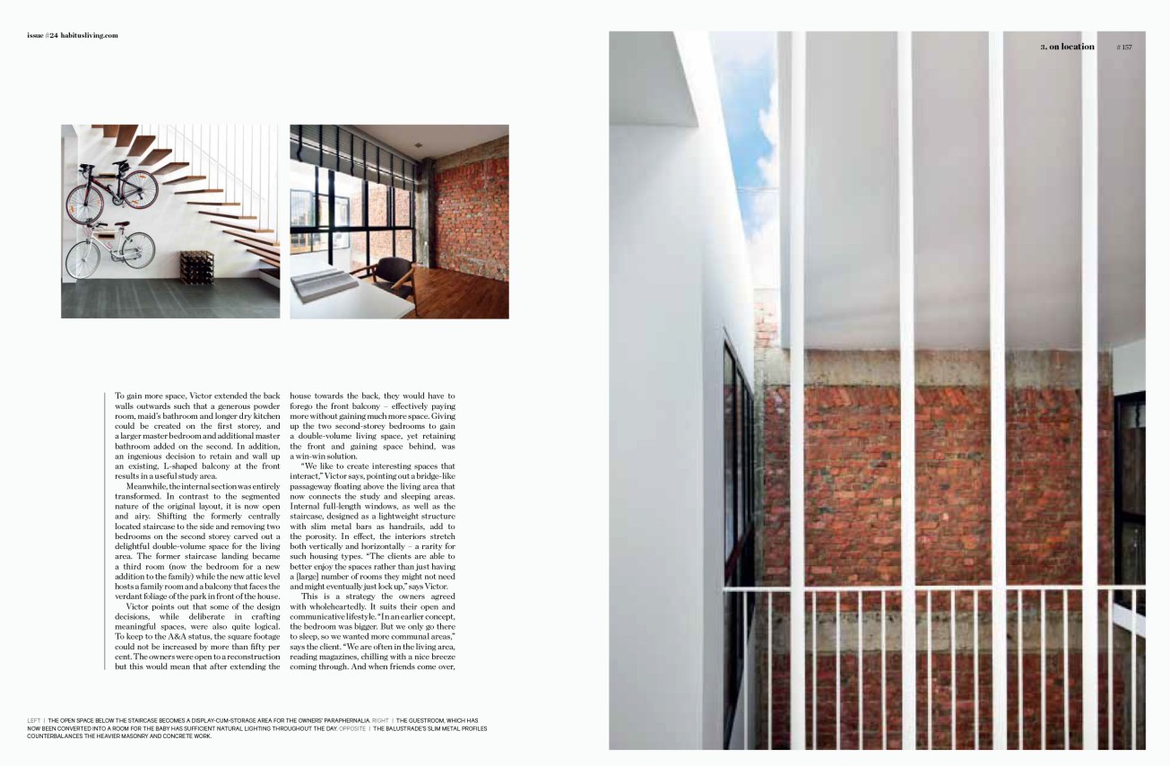
To gain more space, Victor extended the back walls outwards such that a generous powder room, maid’s bathroom and longer dry kitchen could be created on the first storey, and a larger master bedroom and additional master bathroom added on the second. An ingenious decision to retain and wall up an existing, L-shaped balcony at the front results in a useful study area.
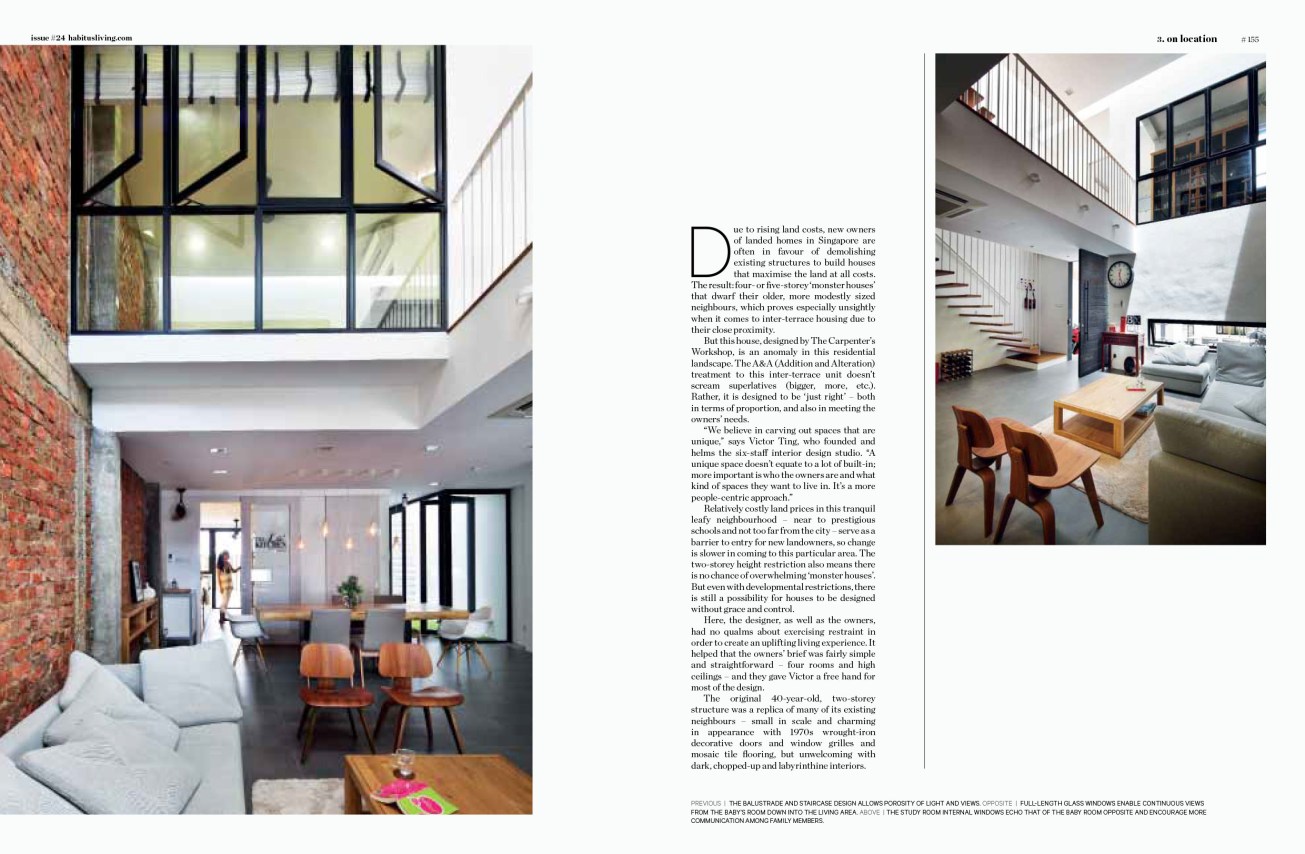
Meanwhile, the internal section was entirely transformed. In contest to the segmented layout of the layout, it is now open and airy. Shifting the formerly centrally located staircase to the side and removing two bedrooms on the second storey carved out a delightful double-volume space at the living area. The former staircase landing became a third room (now the bedroom for a new addition to the family) while the new attic level hosts a family room and a balcony that faces the verdant foliage of the park in front of the house.
Victor shares that some of the design decisions, while deliberate in crafting meaningful spaces, were also borne out of logic. To keep to the A&A status, the square footage could not be increased by more than fifty per cent. The owners were open to a reconstruction but this would mean that after extending the house towards the back, they would have to forego the front balcony – effectively paying more without gaining much more space. Giving up the two second-storey bedrooms to gain a double-volume living space, yet retaining the front and gaining space behind was a win-win solution.
“We like to create interesting spaces that interact,” Victor says, pointing out a bridge-like passageway floating above the living area that now connects the study and sleeping areas. Internal full-length windows, as well as the staircase, designed as a lightweight structure with slim metal bars as handrails, add to the visual and spatial porosity. In effect, the interiors stretch vertically as they do horizontally – a rarity for such housing types. “The clients are able to better enjoy the spaces rather than just having a [large] number of rooms they might not need and might eventually just lock up,” says Victor.
This is a strategy the owners agreed with wholeheartedly. It suits their open and communicative lifestyle. “In an earlier concept, the bedroom was bigger. But we only go there to sleep, so we wanted more communal areas,” the husband shares. “We are often in the living area, reading magazines, chilling with a nice breeze coming through. And when friends come over, we can talk to them while we’re in the kitchen,” the cooking enthusiast says, pointing out the fluid transition from the living and dining areas to the kitchen through the length of the house.
The lofty ambience is also aided by revealing the underside of the pitched roof on the upper storeys and skylights that flood the interior with light. Other simple, but effective gestures, such as a linear courtyard between the dining area and powder room, into which master bedroom on the second storey and the attic bathroom look down into, channels light and breeze from top to bottom.
The abundance of natural illumination means the owners need not switch on the lights during the day. And while there is plenty of light, it is also very much controlled. Skylights are carved out as slivers and located mainly in transitional spaces so that light is indirect and heat gain minimal.
This sensitive way of mitigating the tropical weather is in contrast to the ‘monster houses’ that incorporate as many full-length windows as possible, only to have curtains drawn throughout the day. Here, window openings are carefully placed not only to let in an appropriate amount of natural light and ventilation, but also to take care of privacy.
For instance, rather than conventional full- or half-length windows, the façade is punctuated with a composition of slits. From outside, they create a fortress-like appearance. But from inside, they introduce picture-frame views of green and azure, and can be opened throughout the day without worry of prying eyes, especially now, the owners – share half in exasperation, half in appreciation – that the house’s design has attracted curious passers-by who stand and stare for long periods.
Like the clear-cut planning, Victor has opted for an unembellished material palette, signalled from the entry with a gate of black metal mesh and driftwood-colour timber infill. This aesthetic was chosen not just for its well-weathering qualities, but also with a less-is-more attitude.
“There are many ways of dressing up walls. This is just one of the ways, to follow through from using concrete outside,” Victor says, referring to the russet surfaces whose exposed brick textures are played up by light streaming in. Again, practicality played a part. “The original walls’ condition wasn’t very good and plastering up the [defects] would increase cost. So better to remove the [existing] surfaces and expose them this way,” he explains.
This approach continues into the furnishing and furnishing: a grey solid surface counter and light-coloured timber laminate cabinetry in the dry kitchen; black and white blinds covering the windows neatly. This lends the home a calm and genteel mien – thoroughly suited for the arrival of a little one. There are also enough bare walls for the owners to store-cum-display their outdoor hobby equipment, such as bicycles and motorbike paraphernalia.
Rather than building a house from scratch, Victor shares that it is A&A projects such as this – weaving new possibilities from the old; the unpredictable but charming chanced encounters formed out of material and space – that get him excited. In this case, he has designed a house to be ‘just right’, but created a series of experiences that go beyond that.
