

Issue DA94 Oct/Nov 2016
Back to Bauhaus
Designed by Neri&Hu, the new MCM Haus flagship boutique is conceived as a dwelling place informed by Bauhaus principles.
_
The luxury leather goods at MCM (Modern Creation München) are sought after by stylish trendsetters who are drawn to its bold, irreverent designs, identified by its motif monogramed all over its products and embellishments such as diamond studs. Founded in 1976 in Munich, the brand’s creative energy is driven by its association with art, music, technology and travel. Its new flagship boutique in Seoul’s Gangnam district – MCM Haus – puts forth an equally iconic but also more understated presence.
The word ‘haus’ is symbolically appropriate, making a reference to the brand’s roots in South Korea (it was acquired in 2005 by South Korean retail business company Sungjoo Group). Designed by Shanghai-based architecture and design studio Neri&Hu, the new building is also “a house that embodies the Bauhaus’ totality of artistic mediums spanning industrial, graphic, furniture, interior design and architecture,” says Lyndon Neri, architect and co-founder of Neri&Hu.
The client had requested for Neri&Hu to take their design cues from the Bauhaus principles. Founded by Walter Gropius in the early 1900s in Germany, the Bauhaus school’s key objective was to create a ‘total’ work of art (Gesamtkunstwerk), bringing together all fields of art and craft in the spirit of experimentation. The movement was a great influence on Modernist architecture, art and industrial design and is associated with radically simplified forms, rationality and functionality.
In this project, key materials of mainly bronze and concrete used in their raw nature as well as streamlined forms pay homage to the Bauhaus ethos. Customers approaching the building – a repurposing of an existing five-storey-block with an attached car park volume – are greeted by an eye-catching façade of asymmetrically positioned window openings – like a “curio box” of sorts – resting on a heavy concrete base. Bronze metal mesh is veiled over the large openings, as Neri describes, to introduce depth and textured layering, as does the windows’ protrusions.
“The architectural layering of the concrete base provides a streetscape presence at the scale of the pedestrian and frames the activities inside,” he adds. “The simple massing and form, exposed structural elements on the interior and use of raw concrete pay homage to functionalism, and signals a return to material honesty.” The engaging façade – in hues of shimmering sand and openings that double as window displays – provides a livening presence to the streetscape while at the same time drawing the attention of pedestrians across the road and the cars along the road in front.
This façade is a new addition to the existing building and some challenges had to be tackled in its construction. This includes reinforcement to support the new facade, which was straightened to bridge the gap between the irregular slab edge that joins the parking tower to the retail area so as to create a singular massing. A tight construction deadline and limited budget added to the challenges.
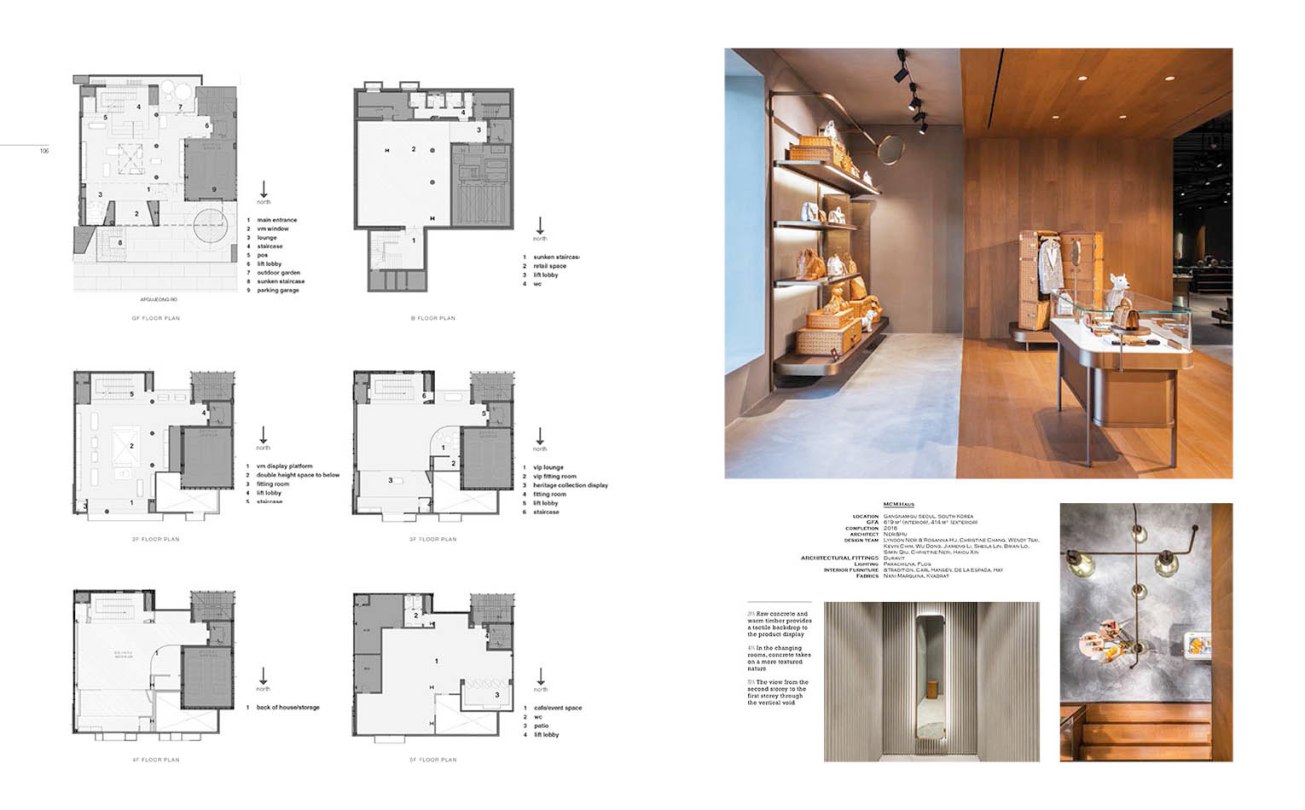
Neri&Hu, however, pulled through with a product that is not only finely finished but also easy to understand and pleasant to experience. Managing a pragmatic layout, customers are greeted with a retail space with the first three stories and basement being accessible from the street front via a sunken staircase. The office and storage spaces are housed on the fourth storey while a cafe-cum-event area sits on the fifth level overlooking the open terrace rooftop.
“From the main door, customers begin their journey on the ground floor. As this is the public’s entry into the space, we wanted the space to feel connected to the exterior and to the upper levels,” says Neri, pointing out the large glass openings to the back and the composition of the large storefront windows.
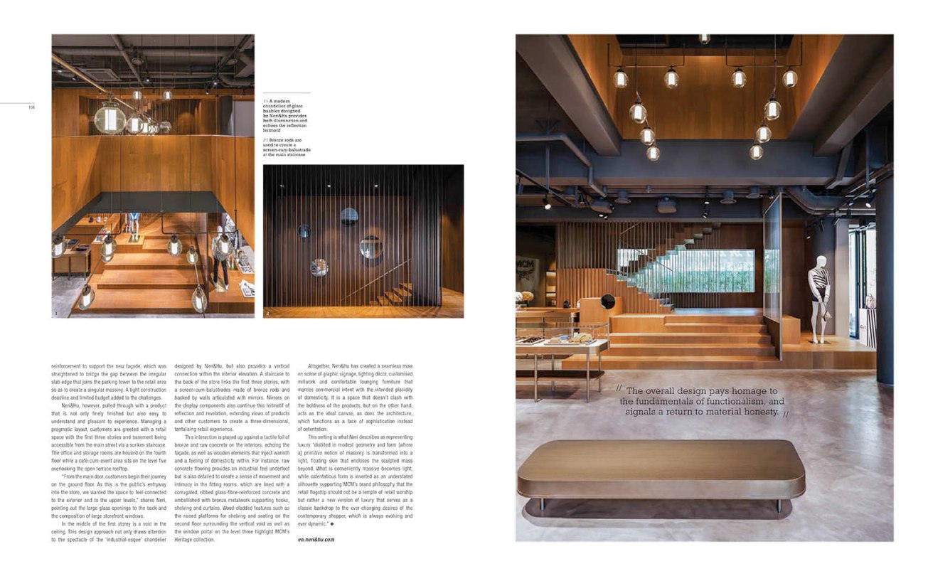
In the middle of the first storey is a void in the ceiling. This design approach not only draws attention to the spectacle of a chandelier designed by Neri&Hu on the second storey above, but also provides vertical connection within the interior. A staircase to the back of the store links the first three stories, with a screen-cum-balustrades made of bronze rods and backed by walls articulated with mirrors. Mirrors on the display components also continue this leitmotif of reflection and revealing, extending views of products and other customers to create a three-dimensional, tantalising retail experience.
This interaction is played up against a tactile foil of bronze and raw concrete on the interior, echoing the façade, as well as wooden elements that inject warmth and a feeling of domesticity within. For instance, raw concrete flooring provides an industrial feel underfoot but is also detailed to create a sense of movement and intimacy in the fitting rooms, which are lined with a corrugated, ribbed glass-fibre-reinforced concrete and articulated with bronze metalwork supporting hooks, shelving and curtains. Wood clads features such as the raised platform of shelving and seating on the second storey surrounding the vertical void as well as a window portal on the third storey highlighting MCM’s Heritage collection.
Altogether, Neri&Hu has created a seamless mise en scène of graphic signage, lighting décor, customised millwork and comfortable lounging furniture that marries commercial intent with the intended placidity of domesticity. It is a space that doesn’t fight with the boldness of the products, but on the other hand, acts as the ideal canvas, as does the architecture, which functions as a face of sophistication instead of ostentation.
This setting is what Neri describes as representing luxury “distilled in modest geometry and form [where a] primitive notion of masonry is transformed into a light, floating skin that encloses the sculpted mass beyond. What is conveniently massive becomes light, while ostentatious form is inverted as an understated silhouette supporting MCM’s brand philosophy that the retail flagship should not be a temple of retail worship but rather a new version of luxury that serves as a classic backdrop to the ever-changing desires of the contemporary shopper, which is always evolving and dynamic.”
