


Issue DA11
Golden Ray
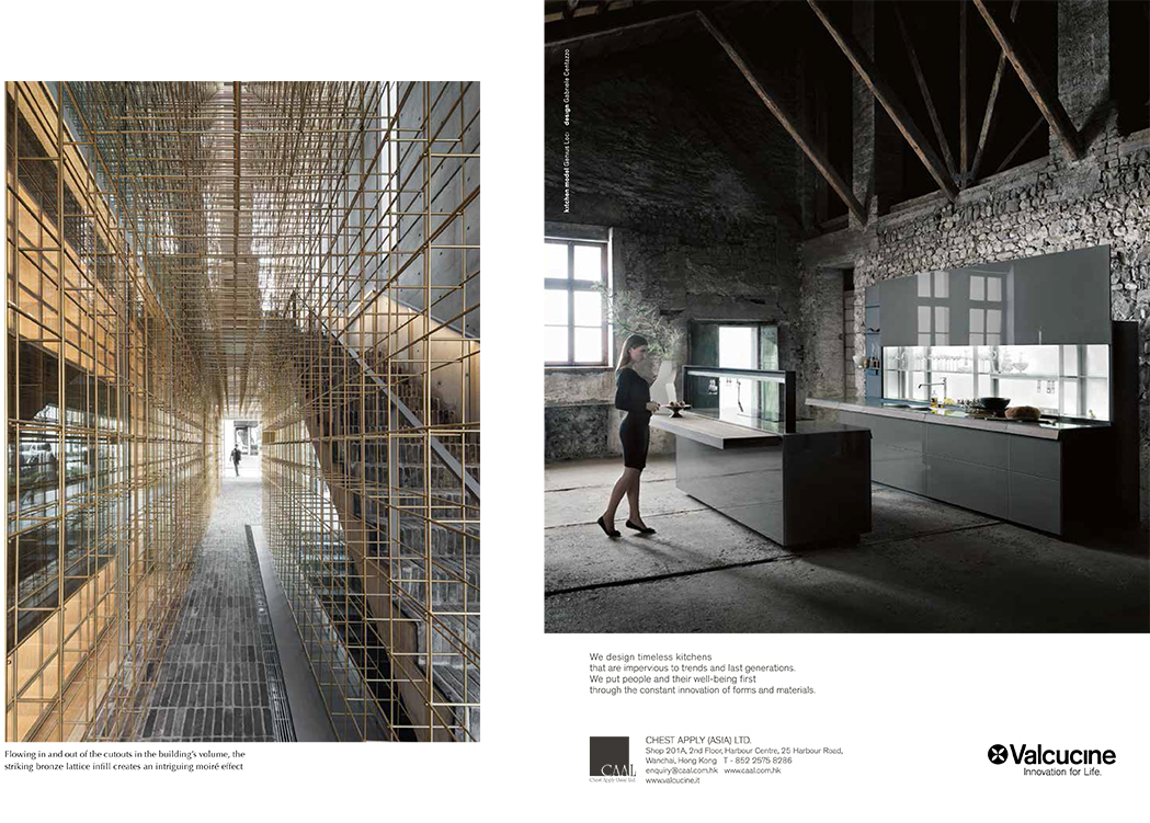
_
The new Sulwhasoo Flagship Store in Seoul dissolves many boundaries – that of solid and void, indoor and out, softness and hardness, structure and furniture. Designed by Shanghai-based architecture and design studio Neri&Hu, the building, housed in the affluent Gangnam district, eschews billboard-style garishness. Instead, it offers an experience that is intimate and highly sensorial.
Its scale melds into the surrounding environment of low-rise, standalone buildings, and its façade of dusty grey stone is equally understated. But weaving through this rectilinear shell is a striking scaffolding-like lattice made of glimmering bronze rods. It flows in and out of the cut outs in the building’s volume, presenting intriguing moiré effects from many angles.
The lantern – a symbolic and literal guiding apparatus ubiquitous in Asian cultures – was the inspiration for the building’s design, says Lyndon Neri, architect and co-founder of Neri&Hu. The original structure was designed by Korean architecture firm IROJE and Neri&Hu’s lattice infill is a fitting renovation strategy. “The lattice works functionally as a ‘signage’ that you have arrived at the Sulwhasoo world, then it guides a customer through to different parts of the building for selling, wrapping, displaying, lounging, etc.,” says Neri.
Inside, the lattice doubles as shelving displaying beauty products. Custom lighting and mirror elements are not only hung within the lattice as functional tools for the ambling customer, the latter is also a device for reflective play that enhances a customer’s interaction with the space. “The main purpose of the building is to show off the brand in a way that allows women to think about beauty and skin care, and relating that cognition with Sulwhasoo. We tried to achieve that through these mirrors all throughout, and complement them with small bronze display stands holding the products to further augment the commercial intention,” Neri explains.
As Neri intends, the bronze lattice truly unifies the different spaces throughout the building while performing a variety of roles: it grants a lightness and shine to the cavernous, stone-cladded basement, acts as display framing devices in the middle levels, and in the open roof top terrace, anchored by pebble stones, becomes a soft space divider, extending perspectives and blurring views with its gridded body that appears to diffuse quite fascinatingly into space and sky.
Throughout the interior, beige terrazzo flooring, oak floorboards and linen curtains serve as a tranquil backdrop, while curve-edged standalone counters and cabinetry based on the lattice grid contain historical objects highlighting the brand’s heritage. In areas such as the counselling room and multimedia space, a more decorative screen element can be found, their patterns inspired by the Sulwhasoo motif of snowflakes and flowers but streamlined by the Neri&Hu team. When different layers of screens overlap, they form the completed motif, highlights Neri. Such details inject richness and liveliness to the experience, while bestowing a touch of feminity to the space that relates appropriately to the Sulwhasoo brand.
There is a dynamism and consistency in Neri&Hu’s portfolio that makes it the much sought-after practice it is today. Its work is grounded in strong conceptual rigour, single-minded intents, rich materiality, precise detailing and quality execution. In the case of the Sulwhasoo flagship store, a new interpretation to the idea of beauty can be experienced – one that is not skin deep, but is all encompassing and inviting.
